About a year ago, I installed a solar PV system at my home. I wound up with a set of 14 panels on my roof, which can produce a max of 5.6 kilowatts output, and a 4.8 kW Dyness battery to store any excess power.
Since my car is an EV, I already had a home car charger installed, but chose to upgrade this to a MyEnergi Zappi at the same time, as the Zappi has some good features to charge from solar power only -- and part of that feature set involved adding a Harvi power monitor.
With HomeAssistant, I’ve been able to extract metrics from both the MyEnergi components and the Solis inverter for the solar PV system, and can publish those from HomeAssistant to my Graphite store, where my home Grafana can access them -- and I can thoroughly nerd out on building an optimal dashboard.
I’ve gone through a couple of iterations, and here’s the current top-line dashboard graph which I’m quite happy with...
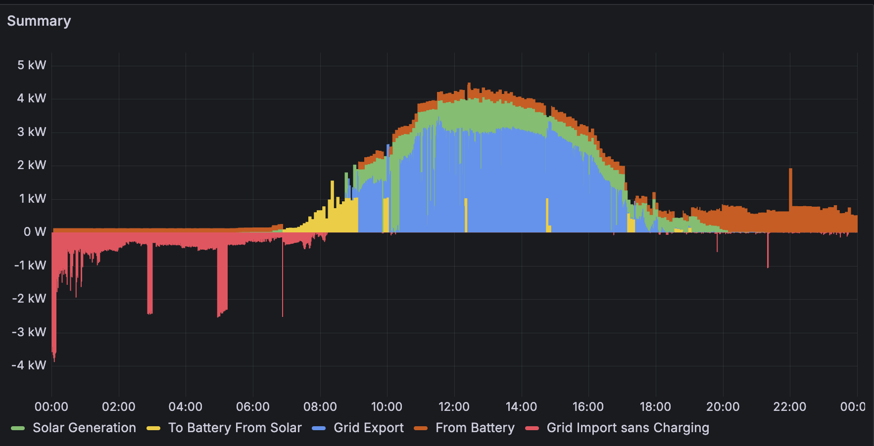
Let’s go through the components to explain it. First off, the grid power:

Grid Import sans Charging
This is power drawn from the grid, instead of from the solar PV system. Ideally, this is minimised, but generally after about 8pm at night the battery is exhausted, and the inverter switches to run the house’s power needs from the grid.
In this case, there are notable spikes just after midnight, where the EV charge is topped up by a scheduled charge on the Zappi, and then a couple of short duration load spikes of 2kW from some appliance or another over the course of the night.
(What isn’t visible on this graph is a longer spike of 2kW charging from 07:00 until about 08:40, when a scheduled charge on the Solis inverter charges the house batteries to 100%, in order to load shift -- I’m on the Energia Smart Data contract, which gives cheap power between 23:00 and 08:00. Since this is just a scheduled load shift, I’ve found it clearer to leave it off, hence “sans charging”.)

Solar Generation
This is the power generated by the panels; on this day, it peaked at 4kW (which isn’t bad for an Irish slightly sunny day in April).

To Battery From Solar
Power charged from the panels to the Dyness battery. As can be seen here, during the period from 06:50 to 09:10, the battery charged using virtually all of the panels’ power output. From then on, it periodically applied short spikes of up to 1kW, presumably to maintain optimal battery operation.
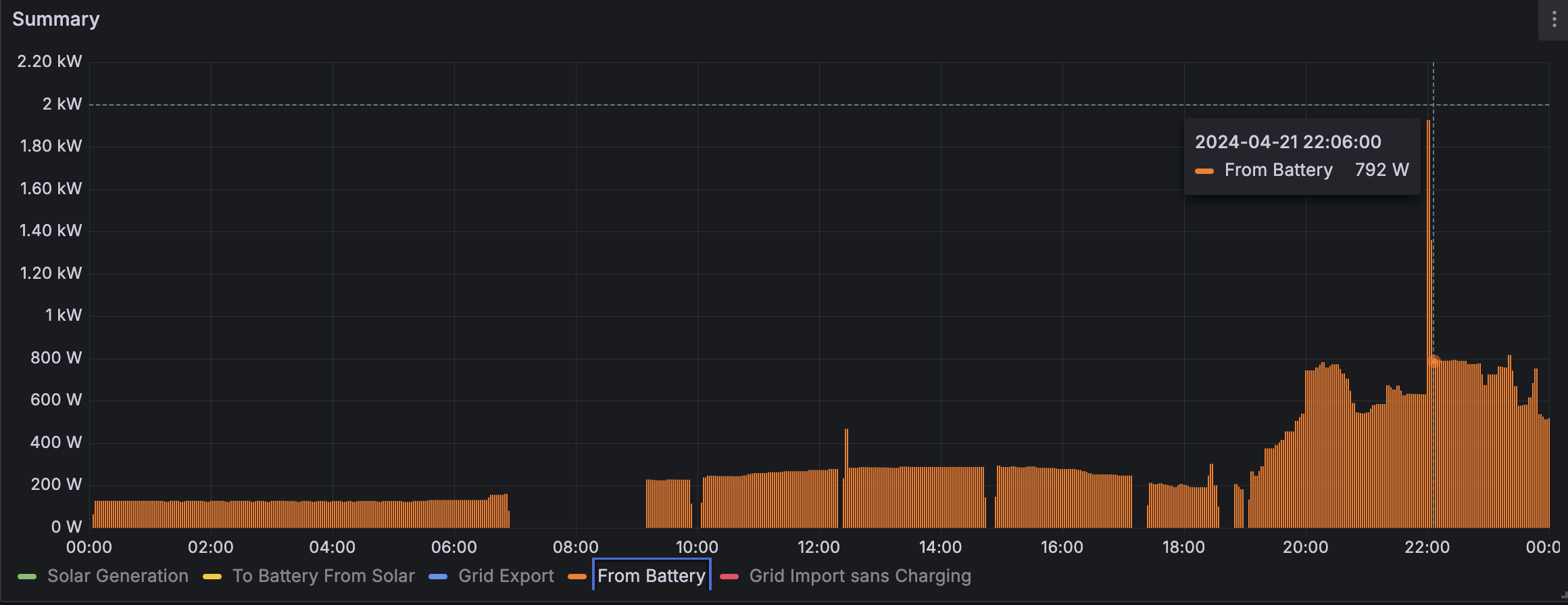
From Battery
Pretty much any time the batteries are not charging, they are discharging at a low rate. So even during the day time with high solar output, there’s a little bit of battery drain going on -- until 20:00 when the solar output has tailed off and the battery starts getting used up.
<
p>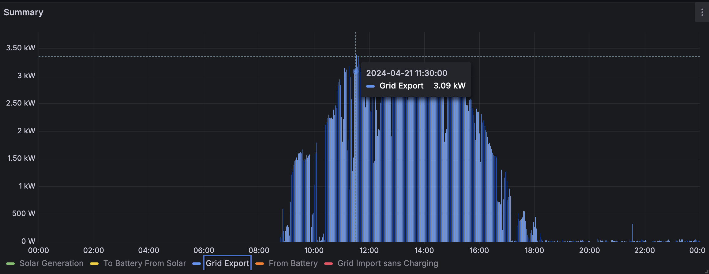
Grid Export
This covers excess power, beyond what can be used directly by the house, or charged to the battery; the excess is exported back to the power grid, at the (currently) quite generous rate of 24 cents per kilowatt-hour.
Rendering
All usages of solar power (either from battery or directly from PV) are rendered as positive values, above the 0 axis line; usage of (expensive) grid power is represented as negative, below the line.
For clarity, a number of lines are stacked:
From Battery (orange) and Solar Generation (green) are stacked together, since those are two separate complementary power sources in the PV system.
Grid Export (blue) and To Battery From Solar (yellow) are also stacked together, since those are subsets of the (green) Solar Generation block.
The grafana dashboard JSON export is available here, if you're curious.