Security: Given the current prevalence of phishing attacks and spyware infestations, designing a good user interface that protects naive users against malware is now more urgent than ever.
Firefox is, of course, widely touted as more secure than MSIE. This is by and large true, due partly to MS' emphasis in their UIs on one-step 'easy' installation and confirmation-dialog reduction (in my opinion) -- but also due to the fact that spyware companies don't yet see Firefox as a target to the same extent.
This changed recently -- spyware 'toolbars' started to appear for Firefox as well. It was quite a surprise to see a dialog pop up when accessing an otherwise normal-looking (though advertising-heavy) page, using my Linux desktop, prompting me to install some 'toolbar' .xpi file!
Firefox 1.0PR now includes code to deal with this. Here's how it works.
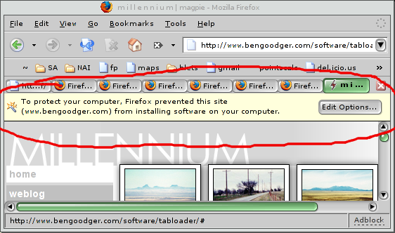
If a site I'm viewing attempts to install an XPI file, I get this prompt:

Note that it's NOT a dialog. This is pretty handy, because it means that I won't get annoying dialogs all the time if I do accidentally go to a unscrupulous site; it just appears like the part of the page. In the clueless user case, they may not even notice that they've been protected, which reduces the risk that they'll install the extension anyway.
(However, I would have extended it by using an icon or look-and-feel that indicated that this was a 'trustworthy' part of the UI, rather than possibly part of the page.)
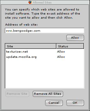
If I hit the 'Edit Options...' button, I get this:

A simple-enough dialog containing the list of sites permitted to
install extensions. update.mozilla.org is in there by default,
and I've added texturizer.net so I can install from their more
extensive list of older extensions. The address of the current
site has been dropped in automatically.
To permit the site, I have to hit 'Allow', then 'OK'. So I do that, and hit the 'install' link on the webpage again:

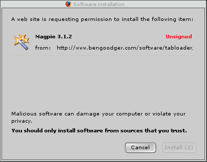
And there's the Software Installation dialog. Note the red Unsigned warning, the proportion of text that is a warning about installing bad stuff (fully half!), and -- this is interesting -- a greyed-out 'Install' button.
The button is on a timer -- it becomes clickable after 2 seconds. This, presumably, is to ensure that people read the dialog! Reportedly, users no longer read dialogs, instead hitting OK on every dialog that appears. In my opinion, this is arguably due to 'the boy who cried wolf' syndrome: by default, MSIE and older Mozilla versions will ask all sorts of stupid questions about 'are you sure you want to send stuff on the intarweb?' whenever you use Google. If anything is guaranteed to induce dialog fatigue, it's that feature.
(Update: actually, that's not the reason. Reportedly, it's a workaround for a couple of social-engineering attacks, whereby an attacker could persuade the user to type a word ending in 'Y', and time the dialog to appear just before 'Y' is typed -- causing the keyboard shortcut for 'Yes' to take effect; or persuade the user to double-click in the right spot, and similarly time the dialog to appear in the right place, in time for the second click. Still, I maintain the measure is useful to deal with the 'dialog fatigue' issue too. ;) Thanks to Smyler and Rod for pointing this out.)
I would have gone further:
- the 'a software install was blocked' page element should have an indication that it's 'trustworthy content'
- both dialogs should default to 'Cancel', to avoid users deliberately pressing 'OK'
- I would possibly require a 'yes, I read this' tickbox to be ticked before the software is installed.
Interesting though. This is the way internet-facing UIs are going to have to develop, in my opinion.